UniVista Insurance

UX/UI for Univista Insurance App
UniVista Insurance specializes in providing affordable and innovative insurance solutions throughout South Florida.
Goal: Redesign the current app to enable faster completion, offer help and guidance throughout process, and make insurances easier to understand.
Responsibilities: Research, Wireframe, Prototype, Testing and Design.
Team (4 people): the CTO, a lead iOS & Android developer, a backend developer and me leading the design.
Year • Location: 2021 • Miami, FL
OUR PROCESS
Following the Design Thinking process, I came up with a plan for Understand, Design, and Implement.
Understand
Understanding the insurance sales process, discovering users’ pain points, and getting insights.
Research: In the first month, I focused on reviewing competitors, conducting interviews with Agents, listening to sales conversations, and reading App stores reviews of our and competitors’ apps.

Competitive research.
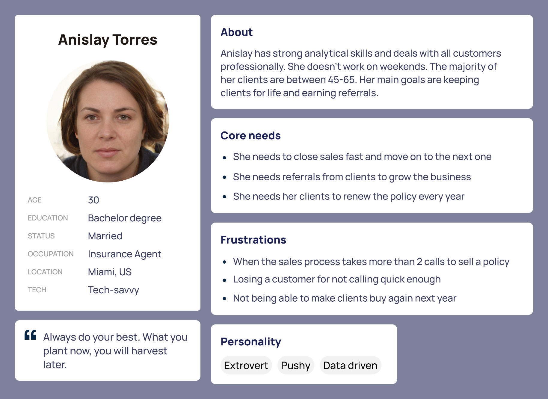
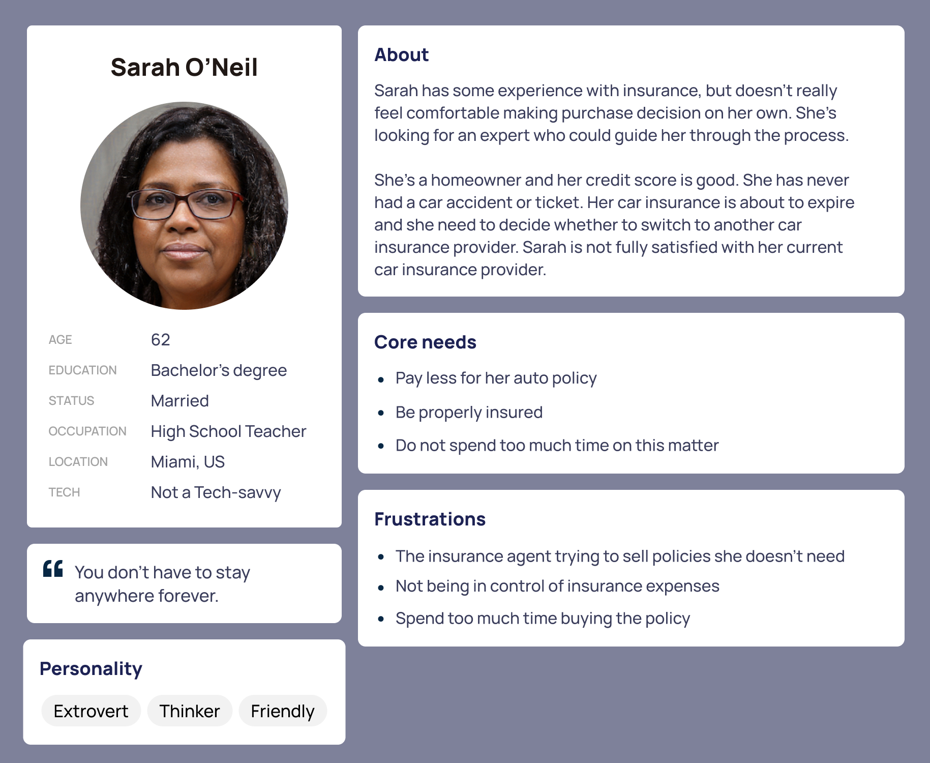
I summarized the gathered knowledge into personas, and identified pain-points at each stage.
The creation of these personas helped me to understand the users' needs, experiences, behaviors and goals. It also helped me to identify the users I was designing for and their expectations.
Re-defined goals
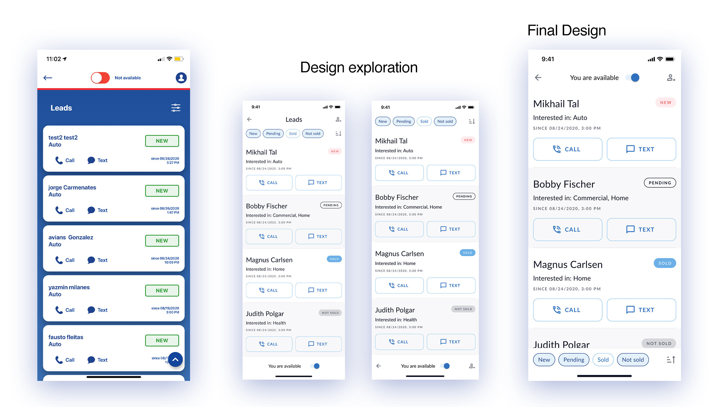
In addition to original goals (enable faster completion, offer help and guidance, and make insurances easier to understand), I found that for Agents is very important to track the sale leads' progress, so I made a complete redesign of their dashboard.
Ideate and prototype solutions to be validated.
Information Architecture & Flows: I analyzed the information architecture of the current app and its different flows, and implement some changes in Buy Online flow.
Design

Wireframes
I wireframe the main screens and some of the changes I introduce.


Prototype & Validate
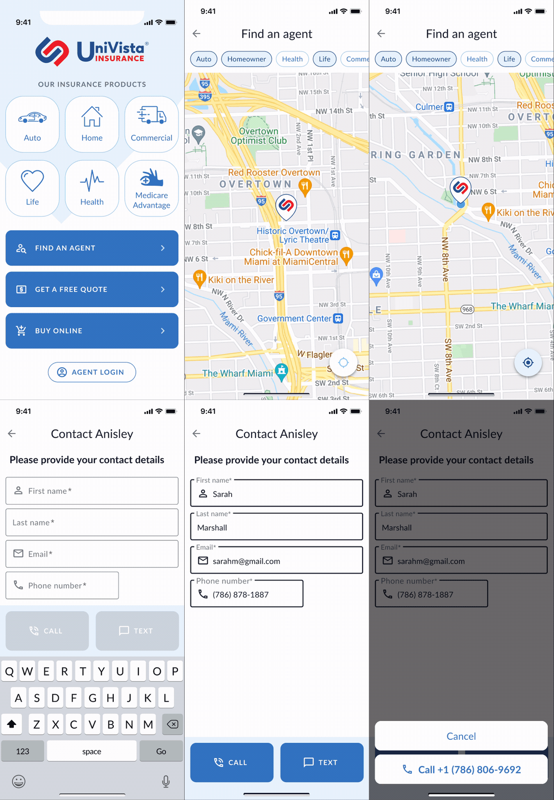
Using Figma I designed the screens and some interactions for the team to review and comment on.

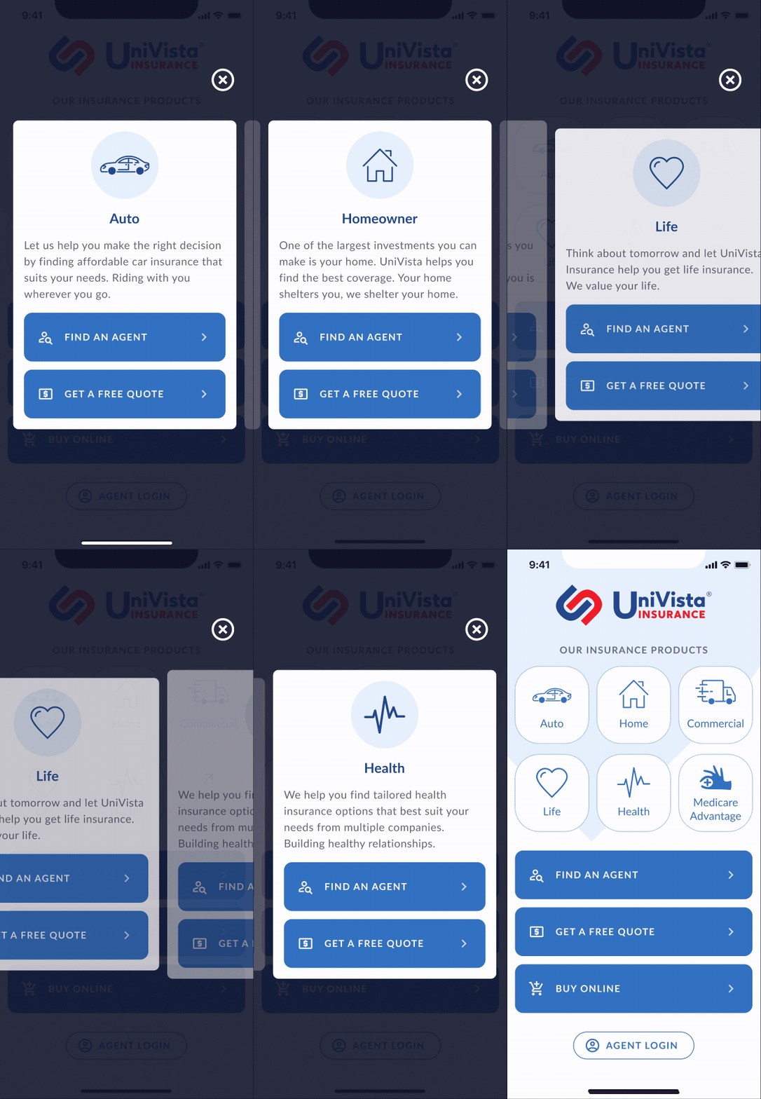
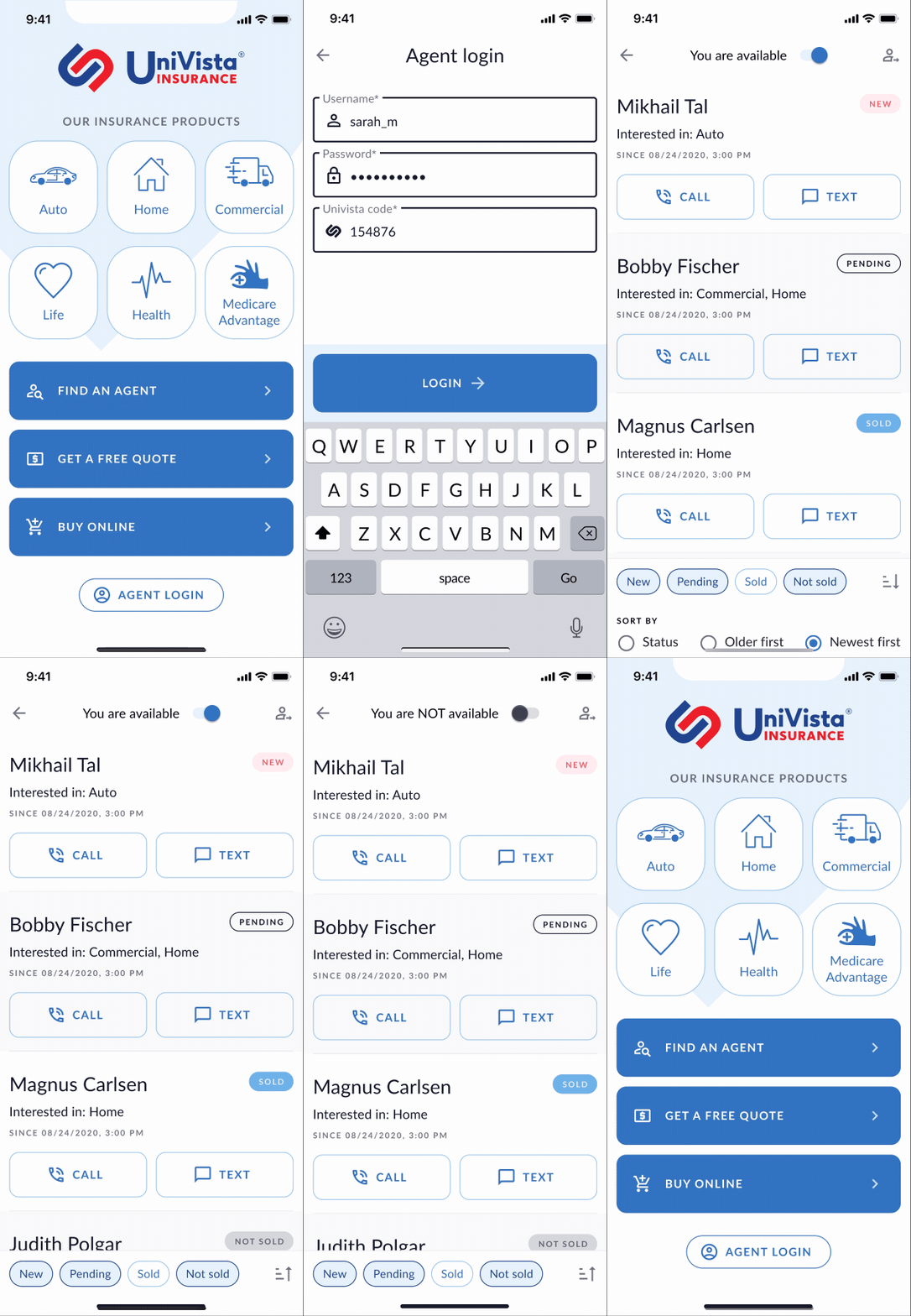
After having the wireframes and some elements of the Design System, I redesigned the main screen applying basic concepts of usability and user interface.
The problem with the old interface is that the elements were not arranged correctly according to ergonomics principles.
In other words, it was hard for the average user to tap on the main elements of the interface (Find agent, Get a quote and Buy online buttons). Also, there is no reason to hide content in a carousel, we can show them on the screen.


Following the same ergonomics principles described above, I redesigned the Agent Dashboard.
Prototype & Testing
Then we made some prototypes to tests with real users, and we perceive a 3x increase in the speed of the “Get a free quote” flow completion.
Implement
Finished all the details and deliver the final design to the developer.
Review & Test: For two months, we continued working and testing the implementation of the design details for each screen in both operating systems: iOS and Android.

Conclusion
In this project, it was extremely important to empathize with the Insurance Agents and listen carefully to the conversations they had with the buyers.
With only 1 month in beta testing, we already saw an increase in the leads generated by the app. It's too early, but we are expecting a 6x sales increase in 1 year.
--------------
If you want to work together on a similar project send me a message.
